CASE STUDY - DNKN YEAH!
|
Hace poco Dunkin’ ha hecho un rediseño de su marca ayudando a reposicionarse. Dunkin’ Donuts nació en 1950 como una pastelería especializada en "rosquillas al estilo americano". Hoy basa su éxito en el modelo de franquicia y tiene más de 11.300 tiendas en todo el mundo, la mayoría de ellas en Estados Unidos.
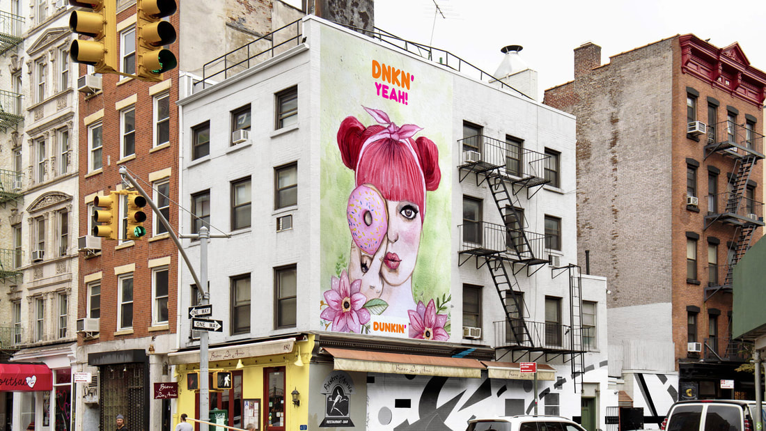
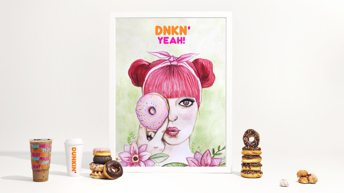
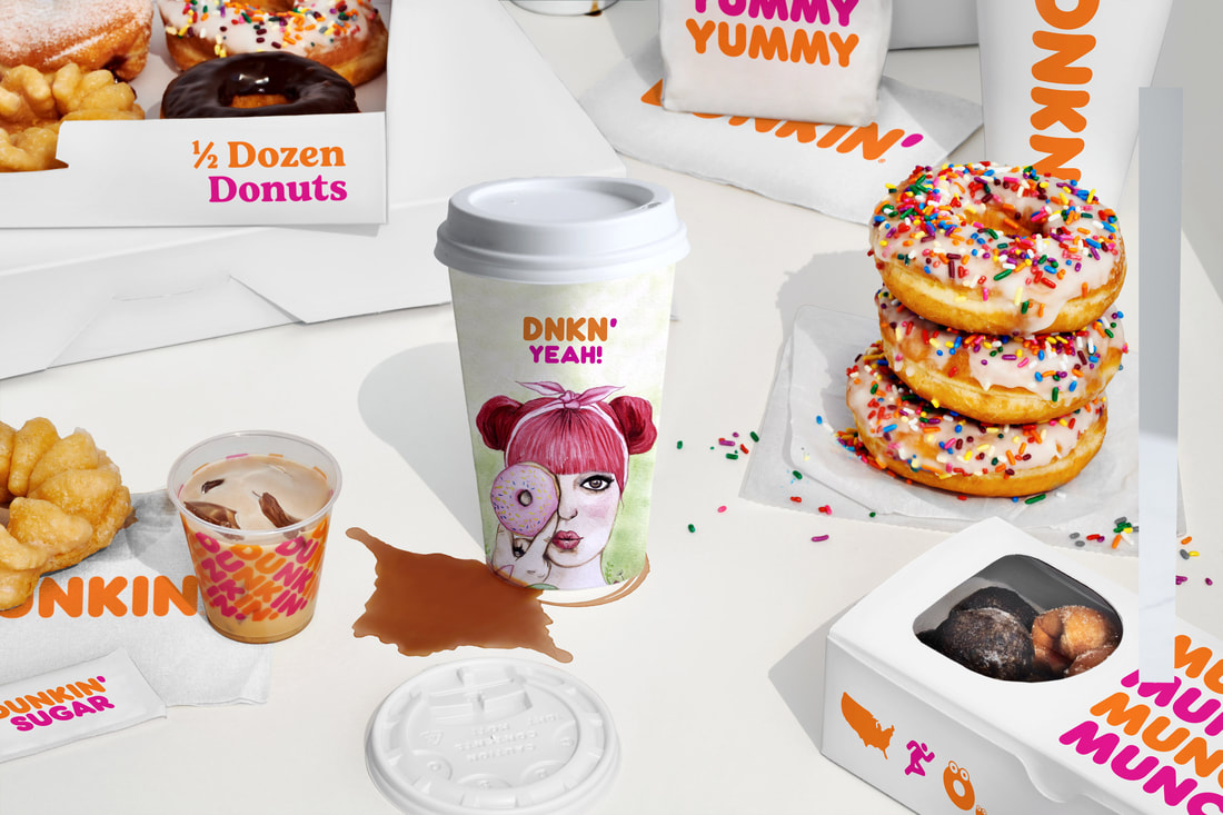
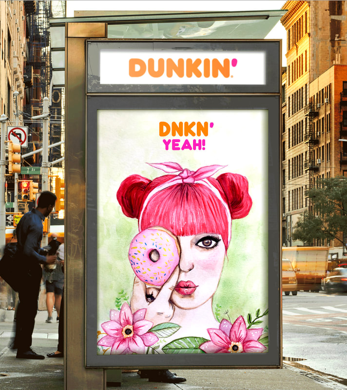
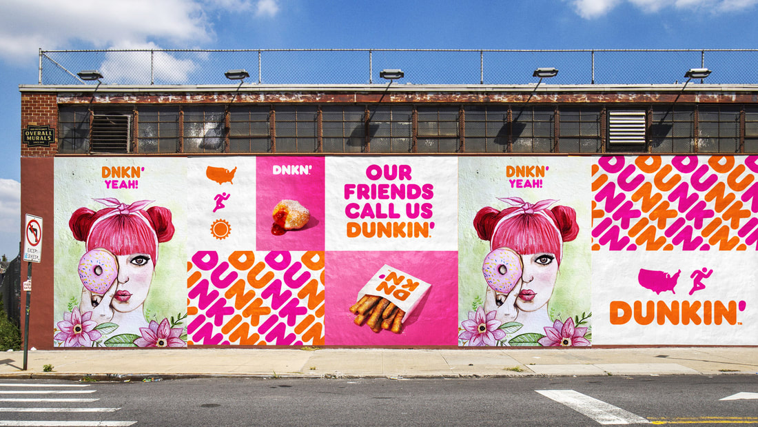
Algo nuevo que se introduce con este proyecto es que la marca Dunkin’ utiliza el acrónimo DNKN. Es curioso como DNKN funciona perfectamente en el packaging porque la tipografía tiene un nivel de reconocimiento muy alto. De ahí me basé para sacar el claim, DNKN YEAH! y con una ilustración potente y colorida hecha con acuarelas y un dontus como elemento llamativo, vestí toda la campaña. |
|
Una campaña continuista a su rediseño de la marca que aunque muy afincada, con DNKN YEAH! demuestran aún más su presencia y posicionamiento de un modo fresco, amable, colorido y divertido. |
|
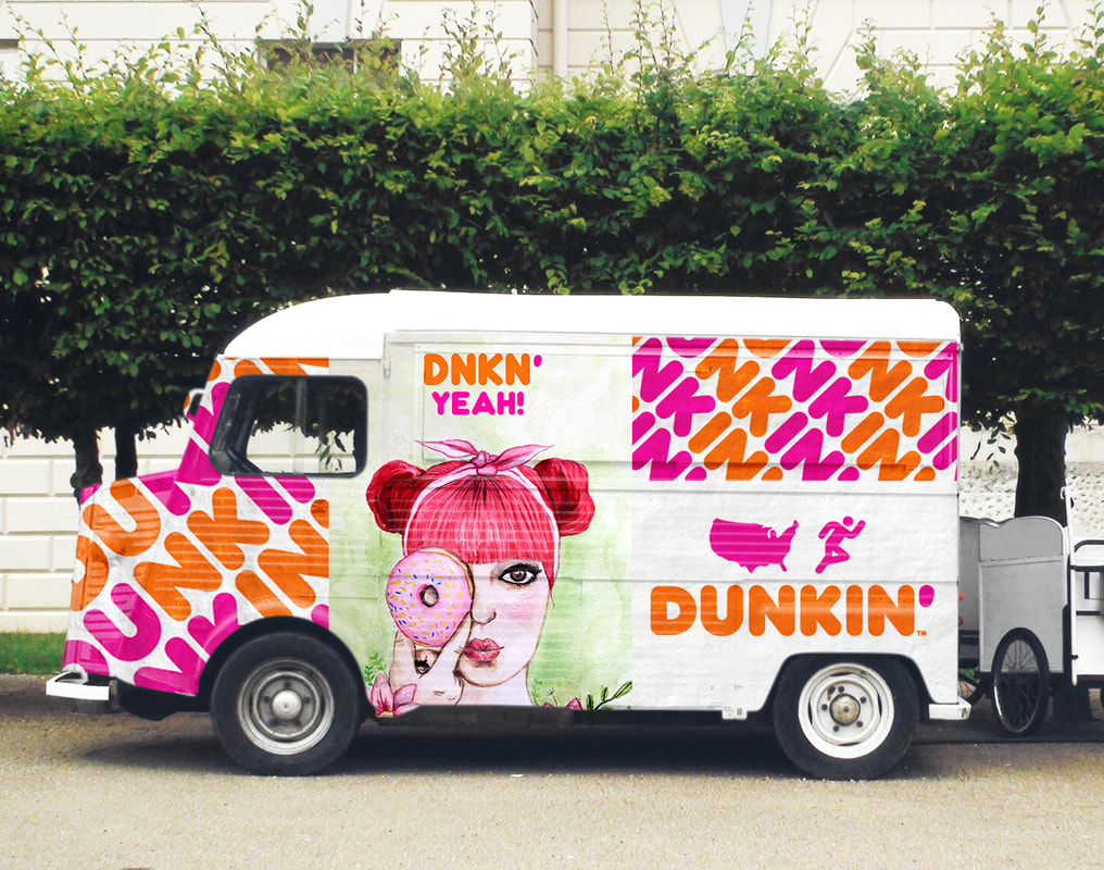
Un elemento que se introduce en esta campaña es un Food Truck perfectamente revestido, porque a pesar de sus fantásticas tiendas hay muchos sitios que DNKN YEAH! llegará a donde tú estés. |