Campaña sector óptica
"Ochio al benessere"
|
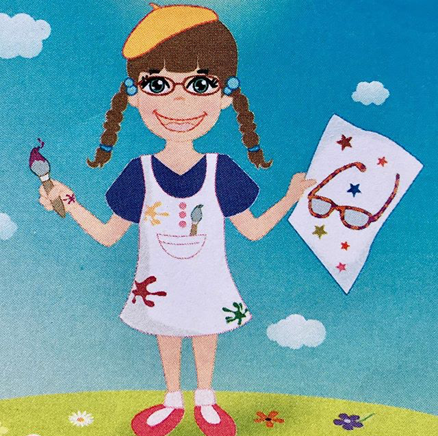
Coincidiendo con el inicio del año escolar, se realizó la campaña "Ochio al benessere" de un año de duración dirigida a los más pequeños y dentro del sector de la óptica. Gracias a ello, los niños de hasta 12 años en caso de variación de graduación, en los 12 meses siguientes a la compra de las primeras gafas, las podían sustituir gratis. Para ello, se realizaron unos pequeños librillos de consejos visuales además de displays y flyers. Esta campaña ha sido publicada en una revista del sector de la óptica como una campaña de gran éxito. |
"Vista da artista"
|
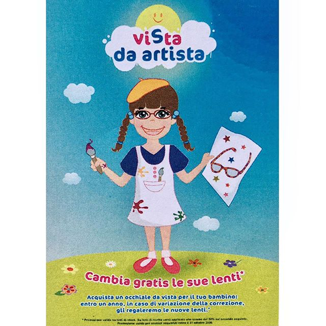
Debido al éxito obtenido el primer año, al año siguiente se realizó la segunda parte de la campaña llamada "Vista da artista".
Igualmente se realizaron librillos de consejos visuales además de displays y flyers. |

CRUZ ROJA
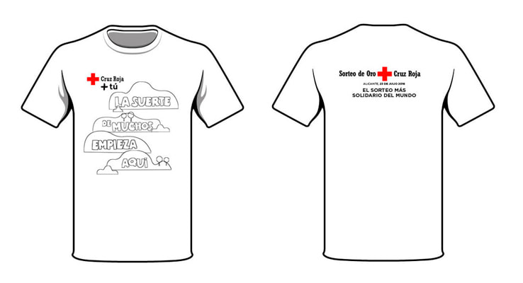
El Sorteo más solidario del mundo
|
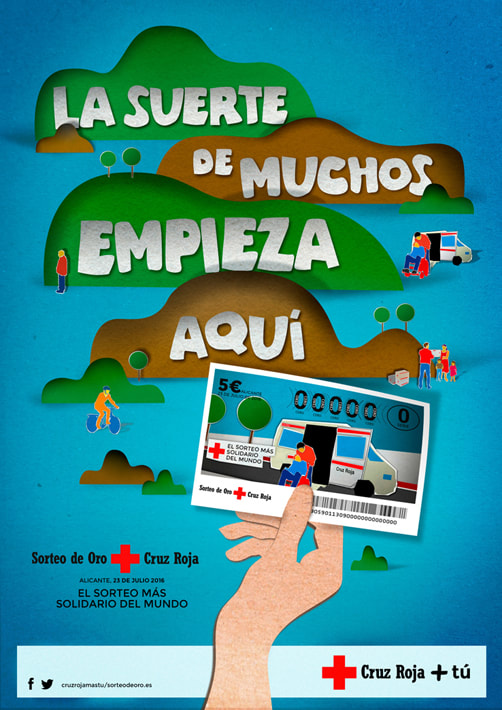
Sorteo de Oro de Cruz Roja: La suerte de muchos empieza aquí. Como todos los años Cruz Roja vuelve con el Sorteo de Oro, un sorteo para ayudar a los que más lo necesitan, gracias a la solidaridad de todos. Con esta campaña pretendemos despertar la solidaridad de los españoles, con una serie de escenas que muestran la labor de Cruz Roja y cómo la ayuda de las personas hace que la vida de mucha gente, pueda cambiar con un simple boleto. Para ello, se utilizó la técnica del recorte a capas, pero digitalmente, y se adaptó a distintos formatos. |
Gráfica |
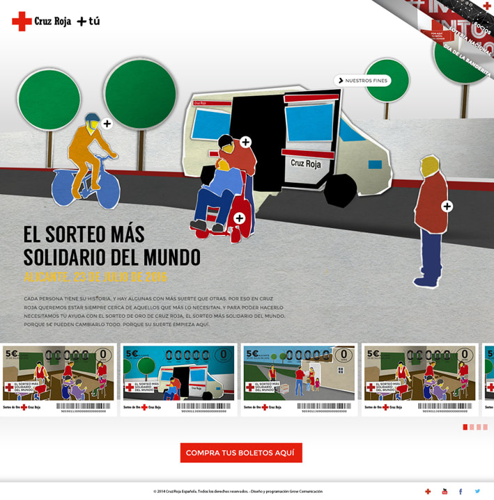
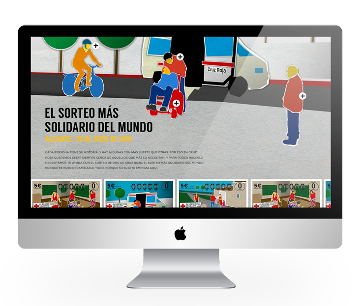
Web paper |
|
Se ha creado un sitio web para no solo dar a conocer la campaña, sino también para comunicar con cada uno de los diseños de los billetes,
la labor de Cruz Roja. |
|
Cada imagen en la web, está provista de información que al pinchar, se desplegará para poder leer la historia y función de las personas que ayudan y su labor:
|
Merchandisign
La Caixa
"Agustito"
|
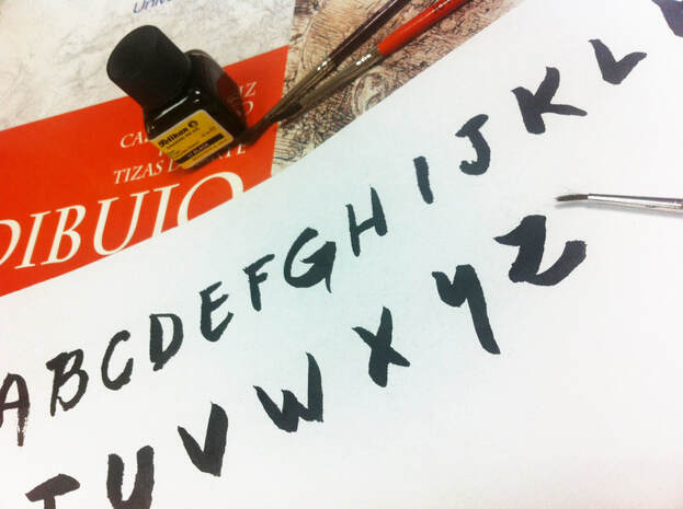
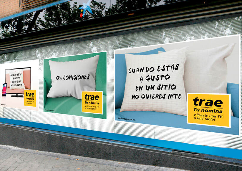
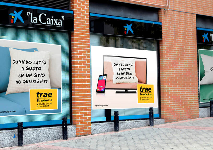
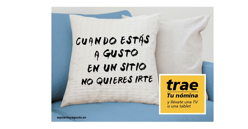
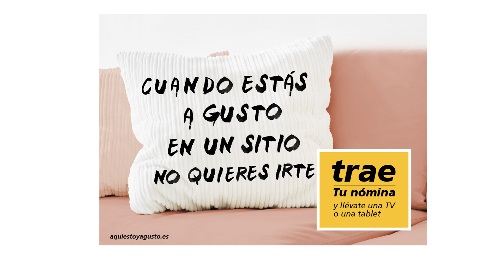
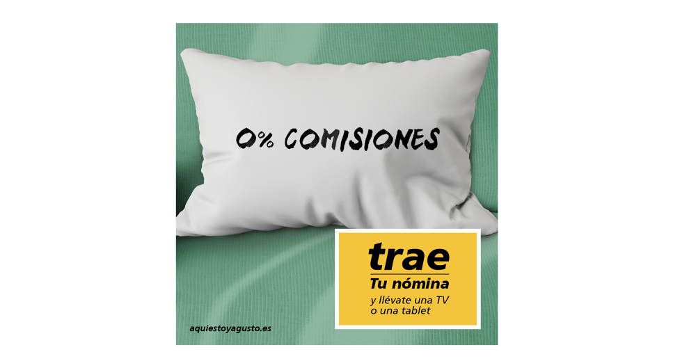
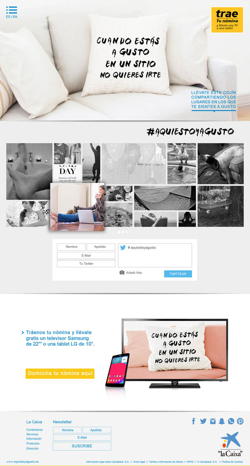
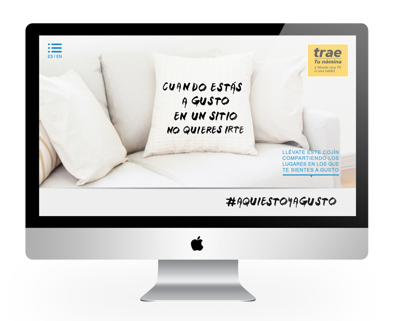
Realización de un icono para La Caixa, El cojín "Agustito". Un elemento de comunicación que nos sirve para conseguir leads, un vehículo para llegar a todos y para que todos se sientan a gusto.
Para ello, realicé el Lettering con tinta china manualmente y se estampó en cada uno de los cojines, estando presente en las oficinas de La Caixa para que todos los clientes de La Caixa, se sientan "Agustito" y forme parte de la imagen de la campaña . |
Cojín "Agustito"como elemento decorativo en las oficinas
|
Dependiendo del tipo de oficina, tendremos:
Corner "Agustito". Un rincón especial donde poder ofrecer las ventajas de la nómina "Agustito". |
|
Todo ello, se adaptó a distintos formatos como Vinilos de escaparate |
Visuales
Web "Agustito"
Making of lettering